Monday, 5 May 2014

Website Homepage Process


1. I created a new site in Dreamweaver, and opened up the index page I had created.

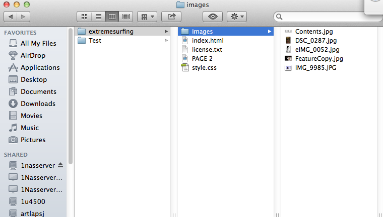
2. I added the images from my own images in the folder. 


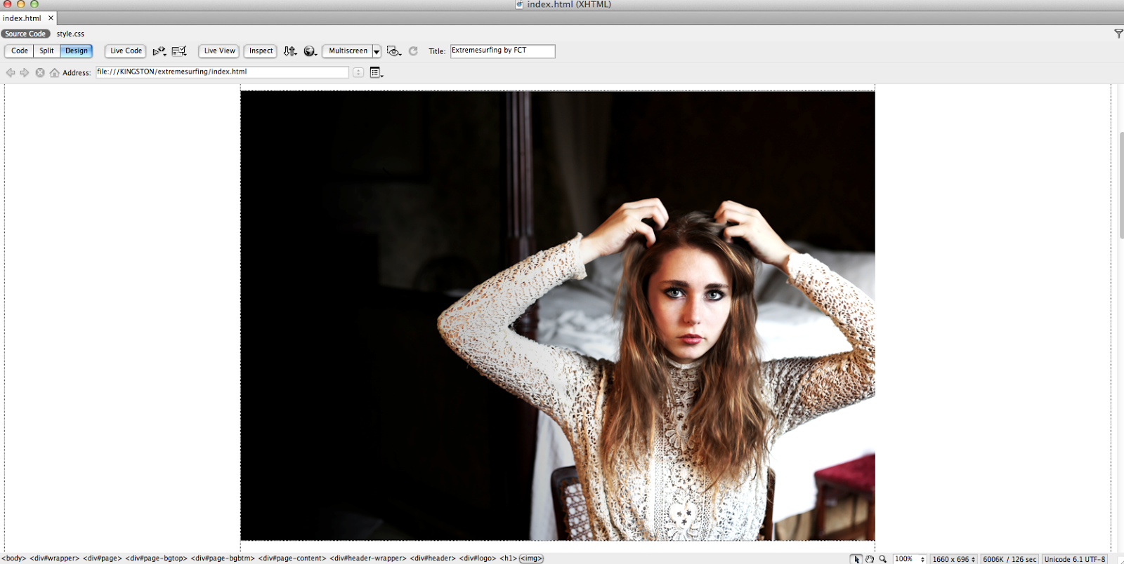
3. I then imported the feature image onto the homepage and the main photo. 


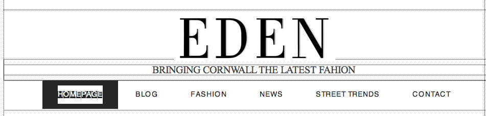
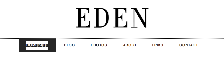
4. Instead of a text masthead, I imported the masthead from the magazine onto the homepage. 


5. I inserted a tag line, but decided that I wanted to keep it simple so got rid of it. 
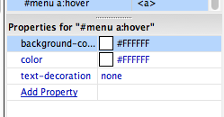
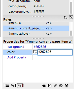
6. I did not like the background on the buttons, so I changed it to white and the text to black constantly
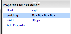
7. By changing the settings to 0px, I got rid of the side bar.
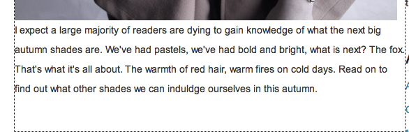
8. I added text after each picture on the page, and added many more images. 


9. I linked each page to the appropriate subheading at the top of the page.  


Website Page 2 Process


1. I duplicated the index page, as there were no more pages included with the template. 


2. I then linked the homepage to the correct headings underneath the masthead. 

3. The layout is better slightly different to the homepage to ensure that there is differentiation, so I changed it by copy and pasting boxes from below to put text in. 


4. I added the text where I had created the space for it.


5. I adjusted the box width to ensure that it was the sizing that I wanted. 


6. As I have done with the other pages, I linked all of the pages to the appropriate subheadings. 

7. Replacing the previous imagery that had carried over from my homepage, I imported my own content images and changed the text to relate to my own products on this section of the website. 


8. I experimented with different fonts until I found the one that I wanted to use as the main font throughout my website.


9. Coming away from the flat plan, I added more link to the top bar, but I wasn't as pleased as I thought I would be with this, so changed it back to the original plan. 


Webiste Page 3

1. Again, I had to duplicate a page, as the CSS template only contained one page for me to work with. I renamed this 'PAGE 3' to ensure that I did not get confused between the pages. 


2. Like on all of the other pages, I quickly linked the top bars to the appropriate pages on Dreamweaver.


3. I then imported the images that I took in the studio that day onto the site and ordered them on after the other to create a page on the latest fashion around college, similar to a street style page. 
4. Above these images, I added a heading, replacing the text that was already there. These, I felt, had to be in capitals because I wanted them to stand out to my readers, especially with their catchy alliteration.

5. Underneath the information about the girls that I provided, I have a short interview with each of them to give an insight to how they chose their outfits. 


6. At the bottom, I changed the website name.


7. I got rid of the majority of links at the top of the page as they were useless, and did not follow my flat plans. 


Thursday, 1 May 2014

Billboard Process

ORIGINAL IMAGES:


What I really wanted to achieve was a simplistic billboard that gets straight to the point and is able to successfully attract my chosen target audience. 

1. After the shoot, I imported the image onto photoshop.


2. It was far too saturated for my liking, so I adjusted the saturation to obtain an image that was softer on the eyes. 


3. The next step was to adjust the levels, creating a contrasted aesthetic that appeals to people who are interested in fashion. 


 4. Though I adore the photograph, I felt as though it was not quite up to the standards of a fashion magazine, so I went through some old photos that I had and imported this one onto photoshop. 


5. I overlaid this layer onto the photo.


6. As, again, the image was too saturated, I turned down the saturation of the gold layer. 


7. Taken from my magazine cover, here I dragged the masthead over to ensure that the audience are aware of what the billboard is for. 


8. The incorporation of the tag line was completed by taking the text tool and typing 'FASHION IS IDENTITY' in Bodoni Svty Two OS ITC TT


9. It all seemed to blend in, so I transform the word 'identity' in italics. 


10. There was something peculiar about her shoulder muscle, so I used the smudge tool to make this less of a prominent problem.

Institution

Earlier in my blog, I made a post on institution and included this link as my research:
http://prezi.com/vhcekclkyu5y/fashion-magazine-institutions/

From this, I discovered that I would be part of Hearst magazines, as this is the one of which my magazine fits best with considering it has magazines similar to, but not exactly the same, as my product. I also feel as though I could bring a niche market to their company and widen up their overall audience, because I doubt that they currently target themselves directly towards the Cornish. 

An area of niche magazines is becoming more popular within our society, which is regional magazines. this is due to people enjoying reading something that is directly targeted towards them and their practices, as they can relate directly to the content. People love the idea of reading about what is going on where they are, that is why local newspapers are so popular, and publishers are starting to reaise that and produce more regional magazines. As of this the publishing group Northcliffe Media now encompass 84 newspapers/magazines across the UK with 5.8 million readers, these magazines include ‘This is Cornwall’. Norcliffe media is owned by the daily mail and General trust, which is a British media conglomerate and one of the largest in Europe. 'This is Cornwall' has an element to it that convinces the readers that it is a lovely little niche magazine that is produced individually by people in Cornwall, but is actually controlled by one of the biggest conglomerate powers that we have in Britain. Though individual magazines are becoming more popular, there is a struggle to make it by themselves when they have such bought competition, the major revenue is being made by the conglomerates.