Monday, 29 April 2013

Lighting

Studio Lighting Techniques

To ensure the photography for my magazine looks professional and good enough in quality to be published, I researched different lighting techniques.

After watching this insightful video, I have made a decision to use the Rembrandt light technique. I have mentioned in previous posts that I intend to select features of which are simplistic, as I know that this will be effective in attracting my target audience, and it is the same in this case. This lighting is simplistic but exceptionally effective. I want to have different lighting on either side of the face to create a better sense of dimension, rather than the chance of the model looking as though she has a relatively flat face.  

If I had more experience in lighting and a lot more equipment, I would experiment with the complexity of the lighting below, as it does seem as though excellent results could be achieved for my product. But seeing as I have neither of these, I will keep it simple. Because I have decided to keep it simple, it does not mean that my photography will not be effective.


Music Journalism and Photography

I found an interesting interview with Charles Shaar Murray, a music journalist who writes for NME. I just found the information on the indie writers' lifestyle

http://www.historyofnme.com/2012/06/10/interviews-with-nme-journalists-charles-shaar-murray/


Here are some tips on how to write good music journalism, which I will follow whence I create my own article for the feature page.

http://www.writing-world.com/freelance/music2.shtml


Live Music Photography Quick Tips

1) Shoot in RAW
Shooting in RAW will give you the most flexibility and the best image quality. With flash memory and harddrive space as inexpensive as it is, there’s no reason not to shoot RAW. If you must shoot JPG because you’re more comfortable with that format, at least shoot RAW + JPG so you’re covered on all fronts, now and in the future, for maximum quality.
2) Crank the ISO
Don’t be afraid to crank the ISO on your camera. Yes, it will produce more noise, but frankly if noisy or grainy images are the worst parta of your issues, then consider that you’ve done everything else right. I don’t know about you, but I’ll take a sharp, grainy image over a blurry, noiseless image any day.
3) Shoot in Manual Mode
Short of strobes and other very short duration lighting effects, most concert lighting doesn’t actually change that much in terms normal levels. Shooting in manual mode is the easiest way to control your exposure and create consistent, repeatable results. Read my tutorials on exposure and metering and practice before using manual mode at a show. You’ll love it.
4) Auto White Balance
People are always asking me what white balance setting I use for my work, but it’s no secret kelvin temperature. I use auto WB almost 100% of the time. For most indoor shows, auto WB will get you ballpark most of the time, with the rare exception being mono-color LED lighting or mixed-source lighting. If you’re shooting RAW, you can always adjust color temperature later without a huge hit to image quality.
5) Wear Earplugs
This is the one gear recommendation I’m going to make. Don’t worry about a better low light lens unless your ears are filled with something besides eardrum-crushing decibels. I recommend Hearos Extreme Protection earplugs for new shooters – they’re cheap, comfortable and reduce a nice -33dB of noise. Read my review of these extremely effective plugs.
 (Todd Owyoung)

Conclusion

So there you have it. 5 essential tips that I guarantee you most pros are practicing every single time they’re in the pit, but which might not be obvious to new music photographers. Better yet, these are tips that don’t have anything to do with camera gear (unless your camera doesn’t support RAW), so you can implement these even if you’re using a point ‘n shoot camera.

Tuesday, 23 April 2013

Audience Survey

SURVEY 1

To ensure I know what it is that my target audience desire in a magazine, I produced two surveys on 'Survey Monkey' with carefully chosen  questions which would get the necessary information from them to allow my magazine to be produced in correct knowledge of their interests. This will allow my magazine to appeal and attract the correct audience, narrowing down specific needs so I can pinpoint the lifestyle they lead and tailor to the needs. In consideration of the answers I receive on my surveys, I will ensure my product is appealing to them, and I will hopefully know exactly what they want from a magazine. I believe that my target audience will be interested in stories that introduce new bands and provide the necessary information they need in order to satisfy them with knowledge of artists. Each and every aspect of the magazine must be attractive in order to appeal to my target audience, but the are a few in particular that I will ensure are perfect in representing the audience, such as photographs and relevant information to the individuals that will interest them, therefore attracting them into purchasing the product. 


As I have mentioned in previous posts, the particular age range of which I have so far been targeting this product towards, is around 17-24. The answers to the age question show me that it will be relatively easy to reach out to the audience I have found myself  targeting, though I might need to drop the age boundaries slightly. The majority of people who took my survey were 13-17, suggesting that I should in fact lower the age, perhaps to 15/16, but still go up to 24, as 18-24 is the second highest. 


The majority of people who took my survey were females, the audience I wish to target my product towards. These results have lead me towards thinking that I should use a female model of which I will not sexualise on the cover. I would like the secondary target audience to be males, as it would widen my audience quite far, exactly what I would need. 


In consideration of this, I will primarily aim my survey towards heterosexual females, though I did want to have a secondary audience of homosexual males, though this secondary audience would be niche, which would not be a problem. Though it does mean that there would not be a very big secondary audience, and consequently, I could potentially be losing money, as I could be aiming at completely different people as my secondary target audience.


When I wrote this question, I was not very optimistic that the people answering the survey would actually read magazines. Though the audience proved me wrong, and the majority read magazines. This way, I feel as though it would be slightly easier to be able to attract an audience, as they would be looking for magazines already, rather than my magazine have to be absolutely amazing for them to want to purchase it.


Not a great deal of people read magazines often, though I feel as though I have the potential to change this with my product, as it will be professional and I will ensure it looks too good to leave on the shelf. The audience will feel ablated to pick it up.


The majority read music magazines, again taking the pressure off slightly if my magazine were to be published, even if there is a lot of competition. 


The most dominant genre of which the people who took my survey listen to, is indie music.  This reassures me that I am surveying the correct type of audience. The second is rock, which is closely related to indie music, so I am also able to learn from this as well. 


In relation to Stuart Hall's theory that the common mood in teenagers is depression, I feel as though this response holds the implication that indie music reassures the person that they are not the only one who is feeling pain or depression. My star vehicle will also imply that she was depressed, but able to overcome the problem, reassuring the audience and persuading them to purchase the magazine so they know how to overcome depression, even if this is not in the article. 


This response clearly shows that some people are quite aggressive when it comes down to mainstream music. I have personally witnessed many occurrences when people of indie culture have gotten furious about how unoriginal mainstream music is.


This shows that there are a lot of indie people in the world who are creative, and so the stereotype that they are into the arts is correct in most cases. I will use this to attract my target audience, and incorporate features of which will appeal to musicians.

Saturday, 20 April 2013

Institutions


I produced a presentation on 'Prezi', containing information on three of the main magazine institutions to assist me in gaining knowledge in this area.

http://prezi.com/tfajejaw2wp6/magazine-institutions/

‘The magazine industry represents a hybrid structure. The top tier has an oligopolistic structure, with four firms controlling the majority of revenues in the industry. The remaining lower tier, however, resembles a monopolistic competitive market structure. Remember that in this type of structure, there are many sellers offering products that are similar but are not perfect substitutes for one another. Numerous publishing companies vie for a share at this end of the market. The large number of individual publishers suggests that there will be several titles geared toward specific interests, yet each is somewhat unique in its presentation. Overall, the prices paid for magazines indicate more of a monopolistic competitive structure. If the entire magazine industry operated as an oligopoly prices would be similar across the industry.’ Alan B. Albarran 

After researching these institutions, I have concluded that my indie magazine would be most suited to be published by ICP media, as magazines such as NME come from it, which is indie. I feel as though the other two institutions would not be suitable for my product to be published by, as they are unlikely to accept my magazine as one of which would be suited to their particular style. In consideration of this quotation from a theorists, I agree that there are magazines targeting particular interests, and niche audiences. Initially, I would have said that my audience would be a niche audience, although, I would not call this particular institution one of which targets a niche audience, rather mass. I would rather my product was aimed towards a niche audience, and I feel as though the company would, perhaps, like to have more niche magazines out in the world.

Saturday, 13 April 2013

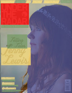
Colour covers


Blue: The artist/ cover star/people
Red: The masthead/title
Green: The text information
Yellow: The names of bands/artists


Blue- 50%
Red- 20%
Green- 10%
Yellow- 20%

The profile medium close up consumes 50% of the page, as the Indie magazine intends for the audience to be focused on the star vehicle of the magazine, rather than other conventions, which might not be as important in this particular case. Personally, I would love to create something with a high percentage of imagery, as I adore photography and feel as though the images I include could be extremely strong in ensuring the success of my own magazine. She is not sexualised like most females on the front of magazines, showing that she is a serious artist and means business. The direction and angle she is facing connotes that she has a lot of wisdom, therefore the audience feels as though her wisdom is great and they must purchase the magazine.

Green, the text information, has a very low percentage, connoting how the producers do not feel this is such an important factor in comparison to the others, there is a lot more yellow, which means that they prefer to focus more on the names rather than the description which can be found inside the magazine. It is a simplistic cover anyway, meaning that the quantities of everything are going to be quite low, especially features which are not entirely necessary.

The yellow shows the names, or proper nouns, used within the text. Other than the headline, this is not an overly large area, as the only other names are very small, though there are seven of them. The area is still larger than the green, text information, as a lot of the time, names are more important that information in the way that artists build their own fan bases, and these fan bases will automatically be interested and attracted to the magazine of which their idol is featured in. 
Taking up around the same space as artist names, the masthead is located in the left hand corner, rather different to the common masthead, as shown in 'Paste' below, usually spread across the top. As it is an indie magazine, there is a good reasoning for doing this; indie people have the tendency to desire to be unique and differ from mainstream people entirely, being quite the opposite to them. So, allowing the masthead to be located in the corner is a portrayal of how the audience see themselves, thus representing the target audience as how they would like to be seen by others, and see what they want in a magazine.