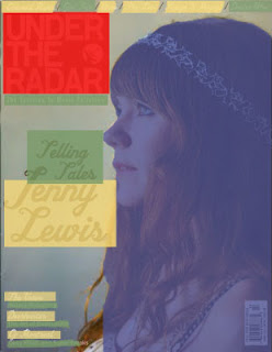
Blue: The artist/ cover star/people
Red: The masthead/title
Green: The text information
Yellow: The names of bands/artists
Red- 20%
Green- 10%
Yellow- 20%
The profile medium close up consumes 50% of the page, as the
Indie magazine intends for the audience to be focused on the star vehicle of
the magazine, rather than other conventions, which might not be as important in
this particular case. Personally, I would love to create something with a high
percentage of imagery, as I adore photography and feel as though the images I
include could be extremely strong in ensuring the success of my own magazine. She
is not sexualised like most females on the front of magazines, showing that she
is a serious artist and means business. The direction and angle she is facing
connotes that she has a lot of wisdom, therefore the audience feels as though
her wisdom is great and they must purchase the magazine.
Green, the text information, has a very low percentage,
connoting how the producers do not feel this is such an important factor in
comparison to the others, there is a lot more yellow, which means that they
prefer to focus more on the names rather than the description which can be
found inside the magazine. It is a simplistic cover anyway, meaning that the
quantities of everything are going to be quite low, especially features which
are not entirely necessary.
The yellow shows the names, or proper nouns, used within the text. Other than the headline, this is not an overly large area, as the only other names are very small, though there are seven of them. The area is still larger than the green, text information, as a lot of the time, names are more important that information in the way that artists build their own fan bases, and these fan bases will automatically be interested and attracted to the magazine of which their idol is featured in.
Taking up around the same space as artist names, the masthead is located in the left hand corner, rather different to the common masthead, as shown in 'Paste' below, usually spread across the top. As it is an indie magazine, there is a good reasoning for doing this; indie people have the tendency to desire to be unique and differ from mainstream people entirely, being quite the opposite to them. So, allowing the masthead to be located in the corner is a portrayal of how the audience see themselves, thus representing the target audience as how they would like to be seen by others, and see what they want in a magazine.


Excellent understanding of issues around representation, forms and conventions in relation to production
ReplyDelete