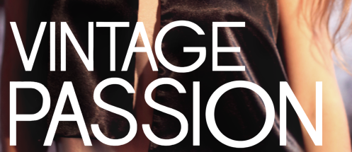
1. I created the masthead by taking a font from the internet, screenshotting the lexis and importing it into photoshop.
2. I imported the image into photoshop.

 4. Like the masthead, I took a screenshot of a font that I liked with the lexis that I chose to incorporate and imported it into photoshop. I then got rid of the background with the magic wand tool and changed the colour to white with the levels tool.
 5. I repeated step 4, but used the colour picker tool to find an appropriate colour from the background, selected the text I wanted to change and used the brush tool over it. I also made some of it smaller.
  6. A barcode was necessary to incorporate, so I screen-shotted one from the internet and added my own text box with the pricing on it.
7. The last step was to add the month the the side of the masthead.


PRACTICAL PROCESS POSTS: three well presented and visually detailed posts with a clear drafting and planning focus. Proficient levels of detail with some excellent features though still lacking a wider scope and audience focus for a level one.
ReplyDelete