PROCESS OF FRONT COVER IN PHOTOSHOP
PT 1. THE PHOTOGRAPH

1.To begin my cover, I opened my chosen image into photoshop.

2. I decided that I did not like the way in which the model was facing, so I flipped the photograph horizontally, so she faced the opposite way.


4. I also thought it was too light, so I created a new layer, painted it in black with the paint tool, the set the layer to overlay.
 5. The spot healing tool came in very handy when it came to ensuring the models' skin was suitable enough for a magazine cover.


5. I noticed that the models' arm was quite hairy, so I created a new layer and painted the correct colours over each part to rid of the hair.

6. I blended the tones together with the smudge tool, as they were relatively blocky.

7. I duplicated the layer to make it stronger and rid of more hair.

8. The next step was to turn down the opacity on both layers, as I did not want the model to look fake.


PT 2. THE MASTHEAD

1. The first thing to do whence creating a masthead is to find a font.

2. I then took a screen shot of my masthead in the font.

3. To incorporate it onto my cover, I opened it in Photoshop.


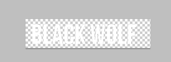 5. Because the background on the photo was dark, I inverted the masthead, as white is a contrast to black.
6. I dragged it onto the photo, but it was too small.

7. I then enlarged the masthead to fit 1/8 of the page.


 8. As I did not want the masthead to cover the model, I erased the parts which overlapped.
  9. I did not think that it looked quite right, so I turned down the opacity slightly, so it was darker where the picture was darker.
PT 3. THE BARCODE

1. I started with a barcode which I found on the internet, taking a screenshot of it and opening the image on Photoshop.

2. As I needed the date and the price, I typed the GB and EU price along with the date across the top of the barcode.


3. I then dragged it onto the cover and resized it.

4. I rotated it 90 degrees counter clockwise and put it in the bottom right corner of the cover.
PT 4. THE COVERLINE

1. DaFont had a typewriter-like font which I thought I would use for my cover line. I took a screenshot and opened it on photoshop.

 2.I then used the magic eraser tool on the background.
 3. I dragged it across to the cover, but it as too small so I enlarged it and put it into the correct place.
PT 5. THE FEATURE COVERLINE

1. Firstly, I obtained a font from the internet and took a screen shot of it, which I then opened in photoshop.

 2. Again, I used the magic eraser tool to rid of the background.
3. I then dragged it onto the cover.

4. Because I was not happy with the black, I changed the colour to burgundy with a fill.

5. Still, I was not quite satisfied because it did not stand out, so I put a gradient on the typography.

 6. Again, it did not stand out quite as much as I had desired, so I put a glow around the text.
 7. This was successful, so I tried outer and inner glow, and bevel and emboss.
PT 6. THE SPLASH
1. Again, I took a screenshot of a font from a website and opened it in photoshop.

2. The next step was to drag it onto the cover.

3. I resized it as it was too small.

4. As it did not look right on the same line, I moved 'understood' underneath by selecting it.

5. I tried making it bigger, which looked a little bit better, but still somewhat wrong.

 6. I turned the opacity down as it was too bright.
7. I then moved the 'I was never' to the end of 'understood', which I preferred.

8. Because it did not look aesthetically pleasing, I moved it onto the model, as though she is saying it.

 9. I then changed the layer to exclusion.
Nicole demonstrate's evidence of excellence in the creative use of most of the following technical skills:
ReplyDelete␣ Producing material appropriate for the target audience and task;
␣ showing understanding of conventions of layout and page design;
␣ showing awareness of the need for variety in fonts and text size;
␣ accurately using language and register;
␣ using ICT appropriately for the task set;
␣ appropriately integrating illustration and text;
␣ shooting a variety of material appropriate to the task set;
␣ manipulating photographs as appropriate to the context for presentation, including cropping and resizing.