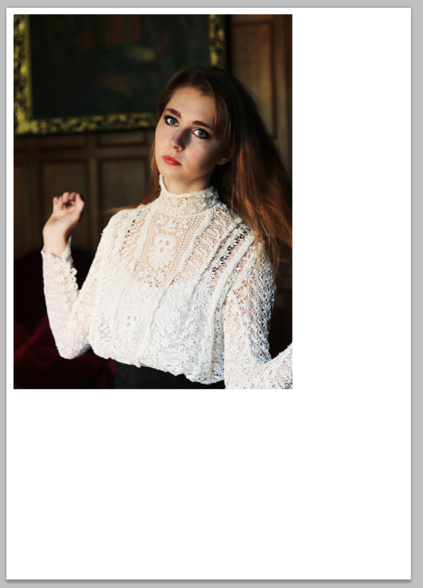
1. I imported the chosen photo onto an A4 document in Photoshop.

2. I then took the masthead from my magazine and placed it on the painting in the background to make it look as though it is almost part of the place.

3. It overlapped onto her head, so I rubbed out the part that did not look quite right.
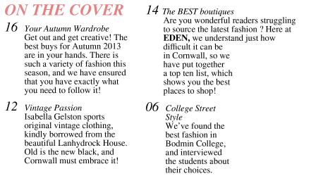
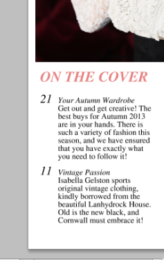 4. The next step was to add my text using the text tool. Some was in bold, some was in italics. I did the page numbers separately, as I wanted to make the larger than the rest of the text and it was easier to form them on a new layer.
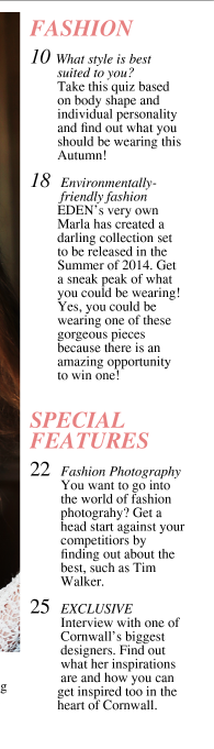

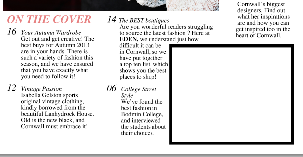
6. In the empty space, I added a black box using the shape too and filler, then laid a white one over the top.

 7. I then added text using the text box, saying 'editors note'.
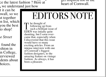
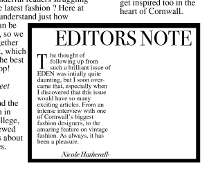 8. The next thing to do was to fill this box with something that was relevant to the magazine as a note from the editor. I used the text box to do this, and on a separate layer, I created a 'T', to make larger than the rest of the text in order for it to stick out and tell the reader exactly where to start reading.
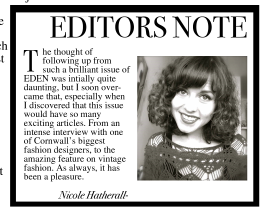
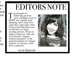 9. A common convention of editors notes is that a picture of the editor is included, so I imported a photograph of myself into photoshop and resized it to fit into the box.
10. I also created a new text box to add my name to the bottom of the note.

11. To ensure it was quirky and not overly boring, I added a smoke effect by downloading smoke brush tools and using the brush tool to paint the smoke on.

12. In the bottom right corner of the main image, I added the article name and page number via the text tool, and put 'passion' in italics.
No comments:
Post a Comment