My Cover

My Content Page

My Double Page Spread

My Billboard

My Website


 2. I added the images from my own images in the folder.
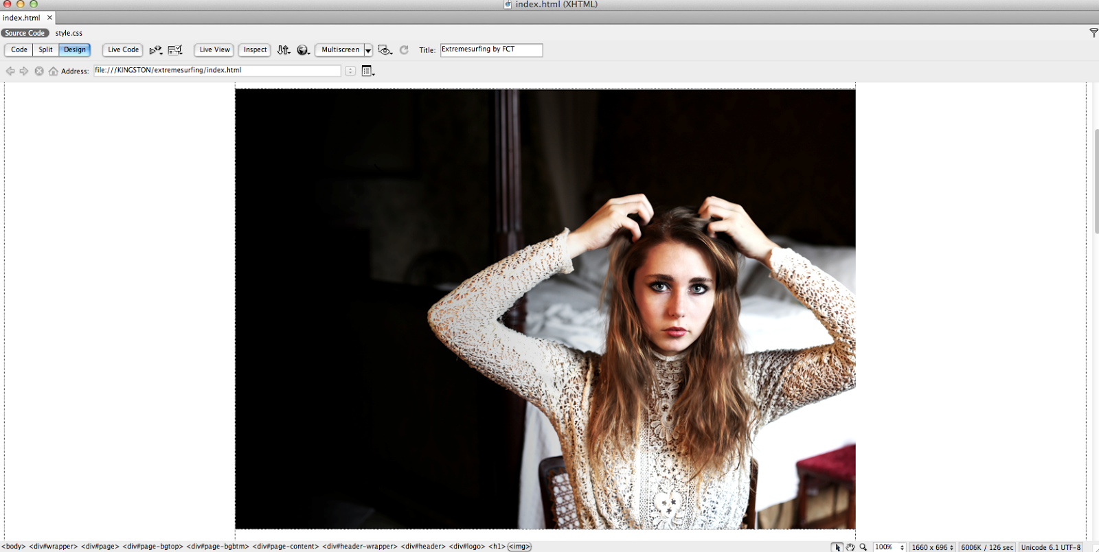 3. I then imported the feature image onto the homepage and the main photo.
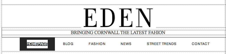 4. Instead of a text masthead, I imported the masthead from the magazine onto the homepage.
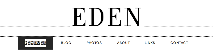 5. I inserted a tag line, but decided that I wanted to keep it simple so got rid of it.
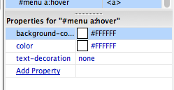
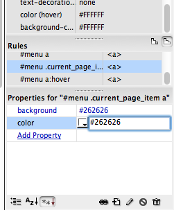 6. I did not like the background on the buttons, so I changed it to white and the text to black constantly
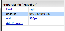 7. By changing the settings to 0px, I got rid of the side bar.
 8. I added text after each picture on the page, and added many more images.


 7. Replacing the previous imagery that had carried over from my homepage, I imported my own content images and changed the text to relate to my own products on this section of the website.


 1. Again, I had to duplicate a page, as the CSS template only contained one page for me to work with. I renamed this 'PAGE 3' to ensure that I did not get confused between the pages.
 3. I then imported the images that I took in the studio that day onto the site and ordered them on after the other to create a page on the latest fashion around college, similar to a street style page.
 4. Above these images, I added a heading, replacing the text that was already there. These, I felt, had to be in capitals because I wanted them to stand out to my readers, especially with their catchy alliteration.

 7. I got rid of the majority of links at the top of the page as they were useless, and did not follow my flat plans.


