PROCESS OF CONTENTS

1. To begin, I made a new document on photoshop, the size of a piece of A4 paper.

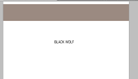
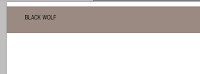
2. With the blank document, I used the rectangle tool to create a bar at the top for the headline to be placed onto.

3. I then chose a font from DaFont.com, took a screenshot of it, and opened it in photoshop.

4. The magic eraser was used to erase the background.
5. I dragged the typography onto the contents page, but of course, it was too small.
 6. Because I had planned to put 'contents' next to the headline, I cleared a space for it by using the rectangular tool in white.
7. As I did with the headline, I did the same with the lexis 'contents'.

8. To help me know where to put everything, I created a column with the line tool.

9. Again, I used a font from DaFont.com.

 10. This time, I changed the colouring of each subheading by using the paint bucket tool.

11. The next step was to add some text and numbers. I used the font 'Myriad Pro', and black for the text, but red for the numbering.


12. As all contents pages have images on, I opened a picture of the featured artist.

13. In the corner of the page, I used the typing tool in Chaparral Pro to put the magazine web address and page number, a standard feature of magazines.

14. Because the space was quite empty, I decided to take a photograph and import it into photoshop.

 15. I was extremely unhappy with the layout, so I used the select tool to cut out any unwanted parts of the picture of Taylor, and placed it above the other image after resizing it.
16. To begin the section for the editor's note, I made a block rectangle with the shape tool and the appropriate colour.

17. I put boxes around particular numbers that linked with the pictures.


 18. In these boxes, I used the text tool to write appropriate article headings.
19. I then dragged my cover and all of its layers into the box.


 21. Using the text box, I wrote an editor's note and a heading for it.
Nicole demonstrates evidence of excellence in the creative use of most of the following technical skills:
ReplyDelete␣ Producing material appropriate for the target audience and task;
␣ showing understanding of conventions of layout and page design;
␣ showing awareness of the need for variety in fonts and text size;
␣ accurately using language and register;
␣ using ICT appropriately for the task set;
␣ appropriately integrating illustration and text;
␣ shooting a variety of material appropriate to the task set;
␣ manipulating photographs as appropriate to the context for presentation, including cropping and resizing.